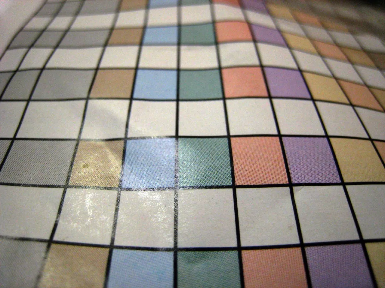
Grid by Doug Waldron, CC BY 2.0 — https://flickr.com/photos/dougww/1798790562
I took a pile of books back to my library about a week or two ago, only to return with even more. I’d gone with the intention of getting one that was a general overview of fonts, colours and grids to read on the beach and not the eight or nine I came home with.
One of the books that I picked up was Grid Systems in Graphic Design Manual for Graphic Designers, Typographers and Three Dimensional Designers by Josef Müller-Brockmann.
Quite a mouthful I thought. I’d not heard of it before and found it in the Library and Information Sciences section rather than in the Graphic Design books. It is widely regarded as the definitive work on the use of grid systems in design. I’d only picked it up because I thought it looked interesting and also because its bright red cover stood out on the shelf.
So grids?
Non-designers probably don’t give too much thought to grids, other than thinking “ooh that looks nice” or “hmmm that looks a bit hard to read”, but a grid system is a way to organise elements on a page by dividing it into rows and columns in order to keep things balanced and organised.
I’d read about grids before and, like everyone else, seen them in action in magazines, newspapers and now in mobile and web pages and apps, but the few things I have designed have either been hand drawn or looked like somebody who just discovered DTP in the 80s.
Knowing what you need to know
A good designer must always analyze the brief.
Josef Müller-Brockmann
Müller-Brockmann’s book is quite heavy on the detail of the how and why of grid systems and has real world examples in print form. It got me wondering if I could recreate some of the grid systems and came across this video on how to set up InDesign so that the grids in the book could be recreated perfectly. So there I was about to dive into the world of spacing and leading and kerning when I realised that it wasn’t what I needed (nor indeed another software subscription just yet). There is nothing in my brief about building a print brochure, or newspaper, or even a zine, the brief is to build a digital presence.
Figma is something I have been using for a while but only from a developer’s point of view, usually to take somebody else’s designs and to turn them into assets that can be used in web applications. I know it is powerful but have only scratched the surface of what it can do. After re-reading my own brief I opened it up and looked at an empty screen not really knowing where to start or what I was doing.
With Figma open I realised that I could get the structure I wanted by using the layout guidelines and before long had gone from a blank screen to a good starting homepage that I could actually build with Tailwind and Astro. I’d gone from reading a book on print design to applying its principles, albeit in a rudimentary way, to digital design.
I’ve been planning this post for a while, my original idea was to create a grid and document that process technically, but what I found more interesting is the process of picking up a book, becoming inspired enough to try and explore some of its ideas before emerging from several different rabbit holes with something actually usable.
This post itself has gone through many different iterations of ideas that I have discarded or more accurately put on the “something to write about at a later date” pile. It’s quite easy to fall into the trap of trying to read, write or experiment with everything that you find interesting but more difficult to focus on what you actually need to do and bring the disparate parts together to deliver something, especially so in a self initiated project.
Amusingly on stepping back I realised that I had acutally kind of recreated the book cover itself, without really intending to.